Wednesday, June 2, 2010

Thursday, February 25, 2010

The Chair Chronicles.

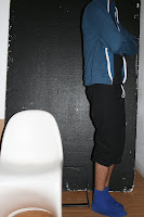
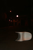
From the Alternative Uses, the idea of taking the chair out of its usual context emerged as one of the stronger ones. We were to have come up with a narrative sequence, and mine was a series of images showing the travels of a chair.
These are two images I particularly like, but the sequence was made up of more, some from the 20 Alternative Uses, but I don't want SorryMrEgg to become repetitive.

Panton 'S' decided to go out and get fucked, drowning the sorrows one suspects a chair to have.
Like being sat on too much.
I'd complain too if Matt kept sitting on me.

The man below with the blue bag tried to steal the chair. It even got as far as him getting into a taxi with it. I had to wrestle it off of him almost.
Some random woman cheered as I reclaimed it. I appreciated her support.
She knew this when I said: 'I appreciate your support.'


This is Matt.

My flatmate Matt is the owner of the chair.
This is what he looks like sitting on it.

On it, and falling off it several times.
A-MAAAY-ZING.

Cup.
CUPCUPCUPCUP.

Part of the chair project.
One of the main design aspects of the Panton 'S' chair is the way they stack.
Giant spooning session.
So I stacked another domestic object.
Plastic cups.


It's not particularly ground breaking or new.
It's just cute.
Cute top.

Wednesday, February 24, 2010

Genuinely a project about a chair.
You can imagine my extreme excitement at this.

So we had to pick a chair, and do a project on it.
It was the most boring thing.
I chose my flatmate's chair. Because it was there. The Panton 'S' chair.
Supposedly I could have made it more fun for myself, but alas I couldn't bring myself to not hate this project. I tried to have fun with it.
The fun parts were (annoyingly) the strongest work of the project.

20 Alternative Uses For The Chair

21 Then.

Saturday, February 20, 2010

Have a Coke and Smile.

So I just got home and I'm a mess.
Posting things on my blog and still managing good grammar while drunk is an actual talent.
I'm not even relying on predictive like I do in texts.
We had to choose a slogan from a selection and illustrate it. I chose
'Have A Coke And Smile'.
I wanted to make this project more interesting to myself, so I played with the idea of not endorsing the product, but rather to work with the idea of the simplicity implied by the slogan; as if everything that was ever wrong would be corrected by having a Coke. So I decided to work with some extreme scenarios, and ask if a having a Coke would really make it better.
My tutor Jim said Coke would never hire me to do an ad for them; I thought [and may or may not have said] that Coke won't, but Unicef probably would.
Below are some roughs; of homelessness, war and famine. I think the aesthetic in some of them is quite nice.
I should state that there was some rather nice white space around these images that are actually A3, but scanning on an A4 scanner forced me to pick the detail out.
Appreciate the considered composition please.


Below is a scan of the actual drawing I used for the ad, of three emaciated children.
One is holding a can of Coke. I knew that I was pretty much straddling the fence between bad taste, and intelligent political commentary. But I think the considered execution pushes it more onto the intelligent commentary side of the fence. It was never supposed to please, rather to provoke thought.


This is what the ad looked like when the slogan and ever recognisable Coca-Cola writing were incorporated into the page.
Rather successful if I do say so myself.
Controversial?


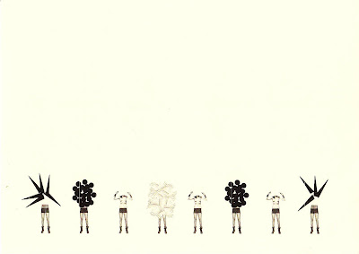
Ants.

More project work. Based on a newspaper headline picked on a specific date, which I don't remember just now. The headling I chose was
'Towering ants' nests in forest get protection'.
I think it's reasonably self explanatory.
(Those are condoms on the nests, in case it wasn't so self explanatory.)

Friday, February 19, 2010

The Selfish Giant.

These drawings were to illustrate scenes from the story of The Selfish Giant.
It is about a giant who doesn't like to let children play in his garden.
And there was possibly a religious undertone to the story, but I don't remember or particularly care for it any more.
I consciously chose to work in a childish aesthetic to correspond appropriately with the nature of the story.
Rather successful I think, no?


The Three Heads In The Well;
Juliette and I first meet. It was a special moment.

Below is a video that we created for our first project on the course and
a link to the YouTube page, just in case.
Our assigned story was about a good princess and a bad one.
Generic morals and lessons were learned.
And we regurgitated the happily ever after story using cut outs and stencils.
FUN.


One of my team members for this project was Juliette. We bonded over the most important things in life,
like blackitude and weave.
It was the beginning of something beautiful.

Thursday, February 18, 2010

Some work.

So this is work I produced way back when I started BA Illustration at Camberwell College of Arts.
These are some images for a project that was to be on something that we were obsessed with. I chose hygiene.
So I drew products associated with hygiene.
Nothing I'm hugely proud of, but nor am I particularly disappointed by them.
I feel the same way about these drawings as I do about Beyoncé's ever lightening skin.
Indifferent.


So I'm a really bad person.

My blogging has most definitely taken a backseat in my life, but I plan on sorting this negligent behaviour. This is me starting. Please, do hold me to my word. I will be a religious blogger. But not to the point where it induces vomit.
Regular posts will now be made here of my work. Not all of it I hope, just work that makes me so elated the urge to share it with everyone is unbearable. I hope it interests people. If not, at least pretend for the sake of my delicate feelings.

Juicy fruit.